 "You can tell a Finn but you can't tell him much" (youcantellafinn)
11/20/2013 at 08:51 • Filed to: FOOTBALL, SOCCER, PLANELOPNIK
 0
0
 17
17|
"You can tell a Finn but you can't tell him much" (youcantellafinn)
11/20/2013 at 08:51 • Filed to: FOOTBALL, SOCCER, PLANELOPNIK | 0
| 17 |
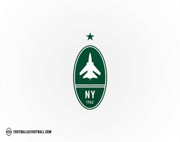
A group of people in Minneapolis decided to see what American football logos would look like if they were reimagined as European style football logos. The results are pretty cool and can be seen on their website !!!error: Indecipherable SUB-paragraph formatting!!! . And there is a bonus planelopnik with the Jets logo. First person to guess the plane wins 20 minutes of AOL which I will send as soon as I find the CD that they sent me in the mail ten years ago.
 ttyymmnn
> You can tell a Finn but you can't tell him much
ttyymmnn
> You can tell a Finn but you can't tell him much
11/20/2013 at 08:53 |
|
Which is why they chose a British fighter silhouette for the Jets logo?
Those are pretty cool, actually. Thanks for sharing.
 Sn210
> You can tell a Finn but you can't tell him much
Sn210
> You can tell a Finn but you can't tell him much
11/20/2013 at 08:58 |
|
I like the logos for the Bills and the Titans better than the real logos. The Titans logo is starting to look dated to me.
 Laird Andrew Neby Bradleigh
> You can tell a Finn but you can't tell him much
Laird Andrew Neby Bradleigh
> You can tell a Finn but you can't tell him much
11/20/2013 at 08:58 |
|
That's rather cool actually. Love the Minnesota Vikings badge.
 Somethingwittyer likes noisy
> You can tell a Finn but you can't tell him much
Somethingwittyer likes noisy
> You can tell a Finn but you can't tell him much
11/20/2013 at 08:59 |
|
This is pretty badass.
 BJ
> You can tell a Finn but you can't tell him much
BJ
> You can tell a Finn but you can't tell him much
11/20/2013 at 09:02 |
|
I like seeing this kind of design exercise. Very cool.
 TylerLinner
> You can tell a Finn but you can't tell him much
TylerLinner
> You can tell a Finn but you can't tell him much
11/20/2013 at 09:12 |
|
The website is supremely annoying, but the designs are cool and interesting.
|
You can tell a Finn but you can't tell him much
> ttyymmnn
11/20/2013 at 09:14 |
|
If I've got the correct fighter in mind, its not exactly British. At least not 100% as it was a joint venture.
Figured people would like these. The modernized coat of arms look to a lot of them make for pretty cool logos.
|
You can tell a Finn but you can't tell him much
> TylerLinner
11/20/2013 at 09:15 |
|
If you get the cursor out of the browser window and put it over the scroll bar you can avoid the pop up / highlighting that it does when the cursor is over a logo.
|
ttyymmnn
> You can tell a Finn but you can't tell him much
11/20/2013 at 09:20 |
|
You're right, not totally British. Another Euro consortium job, so I should have said "European fighter".
|
You can tell a Finn but you can't tell him much
> ttyymmnn
11/20/2013 at 09:31 |
|
A technicality. Anyway you're close enough so as soon as I can find an AOL CD it will be in the mail.
|
ttyymmnn
> You can tell a Finn but you can't tell him much
11/20/2013 at 09:39 |
|
Thanks, but I've got enough.
 fhrblig
> You can tell a Finn but you can't tell him much
fhrblig
> You can tell a Finn but you can't tell him much
11/20/2013 at 09:42 |
|
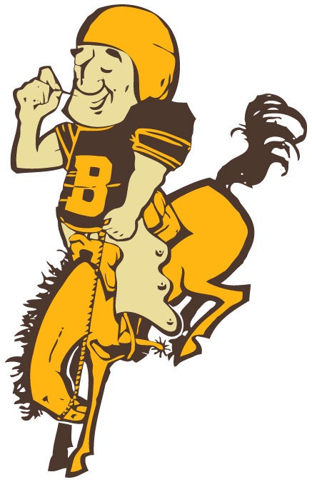
The Carolina Panthers logo looks too much like the Detroit Lions IMHO. And I think I would like the Broncos shield better if they used this old logo on the left side and switched it to those colors, even though the corresponding uniforms are known to induce vomiting.
|
fhrblig
> fhrblig
11/20/2013 at 09:43 |
|
In case anyone missed those uniforms...

|
TylerLinner
> You can tell a Finn but you can't tell him much
11/20/2013 at 11:37 |
|
Doesn't work for me. Still super annoying. Any other tricks that might make it not terrible?
|
You can tell a Finn but you can't tell him much
> TylerLinner
11/20/2013 at 14:51 |
|
Try a different browser? I'm using chrome and have the scroll bar on the right that lets me get the cursor out of the page and still scroll.
|
TylerLinner
> You can tell a Finn but you can't tell him much
11/21/2013 at 08:08 |
|
Stuck with IE8 at work. Maximized the screen and it worked. Thanks!
 idjeff
> You can tell a Finn but you can't tell him much
idjeff
> You can tell a Finn but you can't tell him much
11/25/2013 at 00:42 |
|
nice..butttt....the shape is more of a rugby ball than a football